

Emoji Font Keyboard & Themes
BG.Studio
I approached Emoji Font Keyboard & Themes as a personalization tool rather than just another keyboard replacement. Its main appeal is simple: it lets me change the visual character of everyday typing with emoji-focused text styling and keyboard themes. That makes it interesting for messages, captions, comments, and casual posts where the standard keyboard feels a little dull.
The app comes from BG.Studio and is available for free, with optional in-app purchases ranging from $0.99 to $14.99 per item. It is rated for Everyone, so its basic audience is broad. The more important question is whether you want a keyboard built around expression and appearance, or whether you mainly want the fastest, most practical typing experience possible.
How the keyboard feels during everyday use
My first impression is that the app is designed to make the keyboard feel like part of a personal style. Instead of treating the keyboard as an invisible utility, it puts themes, emoji, and decorative text at the center. That is useful when I want a message to look playful before I have even typed a word.
The speed expectation needs a little perspective. A keyboard can feel quick when its layout is familiar, while a visually rich keyboard can still feel slower if I spend time browsing styles or searching for the right emoji. In normal short conversations, the important part is not only how rapidly keys appear, but how quickly I can move between typing, emoji selection, and visual customization.
For a person who sends expressive messages, that extra choice can be worthwhile. I can imagine using it when replying to friends, preparing a social caption, or adding personality to a birthday message. For long documents, work emails, or anything where I need maximum correction accuracy and minimal distraction, I would be more cautious about making it my only keyboard.
Latest News

Uber Eats Under Pressure: What Happens When Delivery Goes Wrong

How QR & Barcode Scanner Adapts to Android and iOS Innovations

Why Waze Navigation & Live Traffic Is Your Essential Travel Companion
CapCut Mastery: Unleash Hidden Features for Pro-Level Editing

How OS Updates Enhance Roblox Adventures

Teacher Simulator: Exam Time Turns Quick Classroom Judgments into a Repetitive Loop
One practical tip is to separate “appearance time” from “typing time.” I would choose a theme before starting a busy conversation, rather than repeatedly opening customization controls while replying. That small habit keeps the creative part from interrupting the useful part.
Where the visual approach helps
The strongest use case is quick, informal communication. A themed keyboard can make a plain reply feel more deliberate, especially when the message is short enough that a visual touch matters as much as the wording. Emoji-heavy conversations also benefit because the keyboard’s identity is built around that kind of expression rather than treating emoji as an afterthought.
I would also use it for social content that needs a different tone from ordinary text. A caption for a celebration, a playful status update, or a message to a group can look more distinctive without requiring a separate graphics editor. The trade-off is that decorative text should be used selectively. If every line is styled, readability can drop quickly.
Gallery
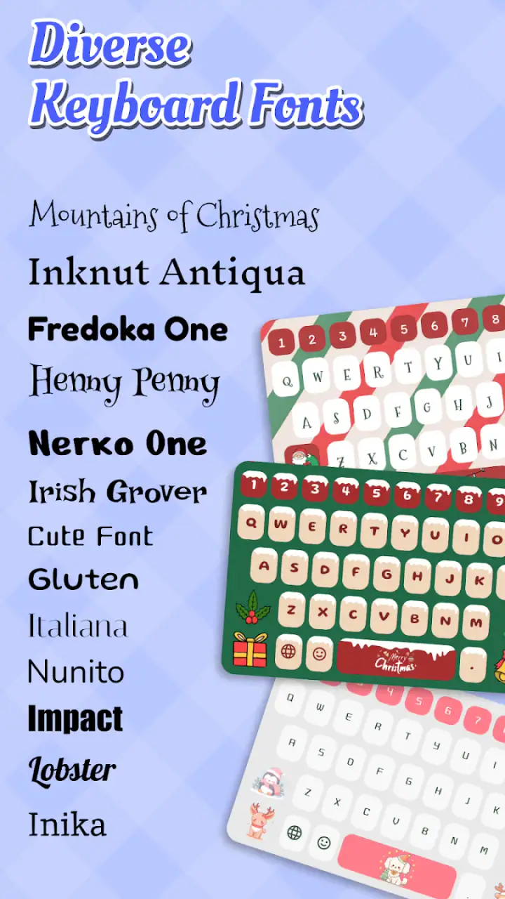
That is one of the less obvious decisions with this app: the most attractive keyboard is not always the most useful one. A busy theme may look excellent in screenshots but make key boundaries harder to recognize in a hurry. I prefer a theme that adds contrast and personality without making the keyboard visually noisy.
What happens during heavier use
Heavy use is less about one long typing session and more about switching contexts repeatedly. A realistic example would be replying to several chats, copying a caption into a social app, searching for an emoji, and then returning to ordinary text. In that situation, the keyboard has to remain predictable while my attention moves between apps.
I would expect the experience to feel most comfortable when I settle on one theme and one typing routine. Constantly changing the look can create friction, not because customization is bad, but because every extra decision takes attention away from the message. The app works best as a prepared layer of personalization rather than a control panel I keep opening mid-conversation.
Another useful workflow is to keep a plain, readable theme available for situations where speed matters. I would use the more decorative option for casual chats and switch to the simpler one for forms, addresses, or longer passages. That gives the app a practical role without forcing one visual style onto every kind of writing.
Emoji selection can also become slower when I am trying to find a very specific symbol under time pressure. My advice is to use familiar emoji first and treat the larger visual range as a browsing feature, not as a promise that every message will be faster. The app’s value is expression, not necessarily reducing the number of taps.
Stability and recovery in normal situations
For a keyboard, reliability means more than avoiding a crash. I also care about whether it appears when I need it, keeps the chosen look, and lets me return to normal typing after moving between applications. Those are the moments that determine whether a personalization app feels helpful or becomes a nuisance.
I would not judge the app only by its most attractive theme. A better test is to use it across several ordinary tasks: a short message, an emoji-heavy reply, a longer paragraph, and a quick search field. If the keyboard remains understandable in each setting, the customization has real value. If I find myself fighting the layout, the visual benefit is not enough.
Recovery is especially important for anyone who experiments with keyboard settings. I recommend changing one thing at a time, checking the result in a simple text field, and keeping a familiar alternative available while deciding whether the new setup suits you. That is sensible with any keyboard replacement, but it matters more here because appearance is a central part of the experience.
I also would not make the app responsible for every important piece of writing immediately after installation. For banking notes, work messages, or anything time-sensitive, I would first confirm that the keyboard behaves the way I expect. This is not a criticism of BG.Studio specifically; it is a practical rule for any app that changes a basic input method.
Compatibility and device expectations
The app requires Android 6.0 or later, which gives it a broad compatibility range across Android devices. That does not mean every phone will feel identical. A newer handset may handle visual transitions and app switching more comfortably, while an older device can make any keyboard with extra customization feel less immediate.
Resource demands are difficult to judge from appearance alone. Themes and emoji tools may look lightweight when viewed separately, but the real experience depends on the phone, the number of other apps running, and how often I switch between screens. I would avoid promising that it will be equally smooth on every device, especially when the keyboard is being used alongside demanding apps.
On an older phone, I would start with a simpler theme and test short messages before committing to a long session. If the keyboard feels delayed, the first sensible adjustment is to reduce visual complexity rather than assuming the entire concept is unsuitable. A clean theme may preserve the personalization while making the layout easier to follow.
Storage and battery expectations should also be viewed sensibly. I would not install it expecting a major performance improvement, because this is a style-focused keyboard, not a device optimizer. Its purpose is to change how typing looks and feels. Anyone searching for battery savings, advanced text prediction, or a productivity-first input tool should compare it with a conventional keyboard instead.
Comparing it with ordinary keyboard choices
The usual keyboard alternatives tend to prioritize fast typing, correction, language support, and practical search tools. That makes them stronger choices for people who write long messages, work from a phone, or regularly need dependable text input. Their advantage is familiarity: I can open almost any text field and start typing without thinking about presentation.
This app takes the opposite route. It makes the keyboard itself part of the message’s mood. Compared with a standard keyboard, its reason to exist is not that it replaces every practical function better. Its reason is that it gives casual typing a more personal surface.
That distinction helps answer whether switching is worthwhile. If I want a keyboard that disappears into the background, I would stay with the usual option. If I want a keyboard that contributes to the look of my messages, this one is more appealing. I might even keep both approaches in mind: use the themed keyboard for personal conversations and a familiar productivity keyboard when accuracy and speed are the priority.
The free entry point makes trying that arrangement easy, although optional purchases should be considered before treating every style as part of the no-cost experience. The listed purchase range reaches from $0.99 to $14.99 per item, so I would browse carefully and decide whether a particular customization is genuinely useful before paying for it.
Who will enjoy it most
I think the app is a good match for people who see their keyboard as part of their online identity. Younger users, emoji fans, social-media regulars, and anyone who enjoys changing the look of their phone will probably understand its appeal quickly. It is also suitable for someone who wants a small visual refresh without redesigning the entire device.
It can be useful for a parent or friend who wants messages to feel warmer and more playful, provided the chosen style remains readable. It may also suit people who send many short replies and enjoy making each conversation feel slightly different. The app’s focus is narrow, but that narrowness is exactly what makes it easy to understand.
I would skip it as a primary keyboard if I mostly write lengthy work documents, depend heavily on advanced correction, or dislike changing established habits. I would also avoid relying on a decorative layout when I need to type quickly in unfamiliar apps. In those cases, a conventional keyboard is likely to feel calmer and more efficient.
Small techniques that improve the experience
My first technique would be choosing for readability rather than choosing the most dramatic preview. Look for clear key separation and enough contrast between the letters and the background. A theme that looks subtle can be better during real use than one that dominates the screen.
Second, I would create a simple routine for switching styles. Use one expressive theme for social conversations, then return to a restrained design for practical typing. This avoids the common mistake of treating customization as an activity that must happen every time the keyboard opens.
Third, I would test the keyboard in the exact places where I expect to use it. A theme that feels comfortable in a chat box may be less suitable in a small search field or a longer note. Testing different text lengths reveals whether the visual choices help or merely look impressive at first glance.
Fourth, I would treat emoji as punctuation for tone rather than filling every available space. The app encourages expressive typing, but restraint makes the result easier for other people to read. A single well-chosen emoji can communicate more clearly than a crowded row of symbols.
Finally, I would keep expectations realistic about speed. The app can make typing feel more enjoyable, but enjoyment and raw efficiency are not the same thing. If I am rushing, I want the simplest layout; if I am chatting, I am more willing to trade a little efficiency for personality.
My performance verdict
With an average rating of 4.6 from around 149 thousand ratings and more than 10 million installs, the app has clearly attracted a large audience for its particular style of keyboard personalization. Those figures do not replace personal testing, but they do suggest that the concept has broad appeal beyond a tiny group of theme enthusiasts.
The current version is 50, and the app was released on December 16, 2024. I see that continuing development as relevant because keyboard apps need to remain comfortable across changing Android environments. Still, my recommendation would depend more on how the chosen theme affects daily typing than on the version number itself.
My overall view is positive, with a clear boundary. Emoji Font Keyboard & Themes is worth trying if I want my messages to look more expressive and I am comfortable giving up some of the invisible simplicity of a standard keyboard. It is not the first choice for serious productivity, long-form writing, or anyone who wants the keyboard to stay completely out of the way.
In practical terms, I would start with the free version, choose a readable theme, and test it during a normal day rather than judging it from a preview alone. If the keyboard remains comfortable during quick replies and app switching, it can become a fun everyday customization. If the visual layer distracts from typing, returning to a conventional keyboard is the better decision. The best reason to use this app is not faster typing; it is making ordinary messages feel more like your own.
FAQs for Emoji Font Keyboard & Themes
What features does the Emoji Font Keyboard & Themes app offer?
Emoji Font Keyboard & Themes provides a wide range of features, including a diverse collection of emojis, customizable keyboard layouts, and a variety of themes to personalize your typing experience. The app also supports multiple languages and offers predictive text input to enhance your communication efficiency.
Is the Emoji Font Keyboard & Themes app compatible with all devices?
The app is designed to be compatible with most Android and iOS devices. However, certain features might vary depending on your device's specifications and operating system version. It is recommended to check the app’s compatibility details in the app store to ensure optimal performance on your specific device.
Does the app require an internet connection to function?
While the core functions of Emoji Font Keyboard & Themes can be accessed offline, some features, such as downloading new themes or receiving updates, require an internet connection. For the best experience, it is advisable to occasionally connect to the internet to update the app and access the latest content.
How does the app handle user privacy and data security?
Emoji Font Keyboard & Themes prioritizes user privacy and data security. The app does not store or transmit your personal data or keystrokes without your consent. It is important to review the app’s privacy policy to understand how your data is managed and ensure you are comfortable with its practices.
Are there any in-app purchases or ads in the Emoji Font Keyboard & Themes app?
Yes, the app offers in-app purchases for unlocking premium themes and features. While the basic version is free, users may encounter ads within the app. Purchasing the premium version can provide an ad-free experience and access to exclusive content. Review the app's pricing details for more information.
Pros
- Customizable fonts enhance text appearance.
- Vast selection of emojis for every mood.
- User-friendly interface for easy navigation.
- Regular updates with new themes and emojis.
- Supports multiple languages for global use.
Cons
- Contains ads that can be intrusive.
- Some features require in-app purchases.
- May slow down older devices.
- Limited free theme options.
- Occasional bugs with keyboard layout.


